Tuesday 21 January 2014
Assignment 4 – Reflection on Tutor Feedback
Here are the tutor’s overall comments:
Thanks for completing assignment 4. I thought you showed a good level of creativity, with a subject that is current and also showed how you have got to grips with Photoshop. Well done. I think you could have deepened your level of research into real and fake in relation to photography both historically and today
…and Feedback on Assignment:
…..When I started to look closer I did enjoy your thought process and thought how you executed your vision was well done. Although I think it is too literal in approach I have to admire the way you made the image match your vision, as highlighted in your sketch. I also like the made up language and the general concept for the magazine, which demonstrates a good level of creativity. My only criticism is that when considering real / fake in relation to photography you don’t have to go to extremes of using manipulation and Photoshop in a dramatic and obvious way. You could use the software in a subtle way and therefore confuse the viewer with what appears to be real but is not. In fact this is at the heart of photography as truth and an issue that has been live since photography began. One of the first photographs was by a man who staged his own death!
http://en.wikipedia.org/wiki/Hippolyte_Bayard …….and other comments on context: Learning Logs or Blogs/Critical essays (Context) It’s great to see you continue to be engaged with your reading and OCATV visits. Taylor Wessing was a good idea and I enjoyed reading your points of view on the winners and others. These trips must not be underestimated in terms of importance to your studies. You also demonstrate a good level of Photoshop awareness when using it for touching up images and have made your position clear on how far you would go in changing images. In terms of making your blog easier to navigate may I recommend you put a label for your assignments so the assessors can easily link between your blog and your assignments. Suggested reading/viewing (Context) Looking at the work of other photographers and visual artists will open-up greater creative responses within your own practice. Dave did an excellent job with his research for this assignment – you might be interested. I really felt like he got beneath the areas of importance for the real/fake debate in digital or manipulated photography and what this assignment was based upon.
http://davebartlettdpp.wordpress.com/2013/11/28/assignment-4-real-or-fake/ Other artists you use manipulation: Wendy McMurdo Julia Fullerton Batten Conclusions / Pointers for the next assignment Make your final assignment something that really interests you!
Reflection My reflection on feedback was included in an email to my tutor:
I understand that there are more subtle ways of using manipulation, maybe I need practice at doing that. My image is an expression of the way I see the situation. Unfortunately, I have the “crash bang” approach to assignments. I get an idea I think will work, put my head down and pursue it. I’ll try to remember to pause occasionally and ask myself if I’m on the right track or if I could do it differently.
Assignment 5 is coming on slowly. As I mentioned I have registered DPP for assessment in March but it will be touch and go. I may have to push it onto the July event. At your suggestion I put my Assignments in a separate blog some time ago. The link is on the top right listed under ‘My OCA Blogs’ above my photograph. Where my blog refers to a particular assignment, I’ll add a hyperlink if I can’t add a label. For level 2, I shall be moving to Wordpress which I understand is more flexible.
I’ve looked at the links you included and found Dave’s research very useful. I have actually read most of the topics he included at one time or another but didn’t think to write and include a report to my blog – omission noted for future action. All part of the “re-learning the learning process”.
Talking of which, I was discussing the Level 2 options with Eddy at the weekend and he mentioned the amount of written work that is required for the courses. I achieved an ‘O’ level in English in 1965 and since then have not written a sizeable or serious essay. I am finding it increasingly difficult (i.e. it takes me a long time) to marshal the ideas I get from my research and reading into a coherent form. Are there any resources or techniques that you can recommend which may improve my skills?
Sunday 12 January 2014
Assignment four: Real or fake?
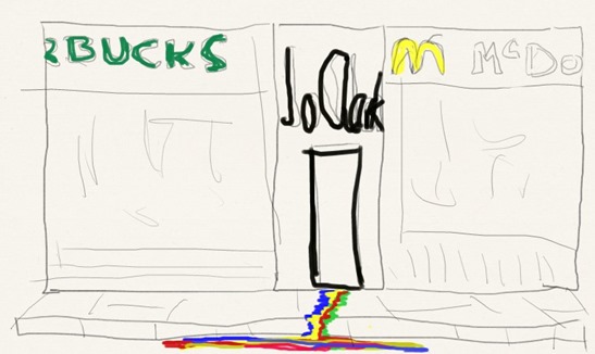
13/12/2013 I've had a few ideas about this one. Thinking of the globalisation of our High Streets and posing the question: Are the global brands squeezing the local colour out of your High Street? Notes: Use composite of shop fronts. 2 big brands either side of a local café distorted vertically converted to monochrome with colours running out over the pavement and down the drain. Look for shop fronts about the same scale - without parked cars. May have to add a clear piece of pavement and a SW drain. Photographs in pedestrian precincts ideal - search Google street view for locations near here. Farnham has both a Subway (The Borough) and Starbucks (Lion & Lamb) Alton has a Subway (High Street) Farnborough has very little but I did pick up the story of the unsuccessful campaign to save the former Tumbledown Dick pub from being turned into a McDonalds Drive through. Guildford High Street is the best venue, Starbucks, McDonalds and Jo Clark's café bar as the local colour How to make the colours look like flowing paint - research PS filters/plugins? Name of the magazine?............ Have your say - Ĉu via diru (Esperanto) Made up magazine – made up language! Here is a quick (bad) sketch of the idea in my head.
Here is my first attempt at the image after a visit to Guildford High Street. This attempt was a rough try out to see if the idea was practical.
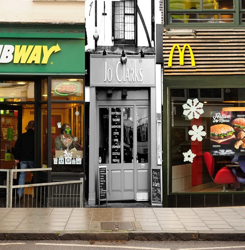
This attempt highlighted a few problems, mainly to do with scaling the images but the idea was there. I need another image for the left hand shop (too much detail to remove) and the central image’s scaling needs to fit so all the shopfronts and name boards are of similar height. I will also experiment with a selection layer on the monochrome image to show the colours running downwards and work on a method of showing the colours running across the pavement to the drain.
19/12/2013
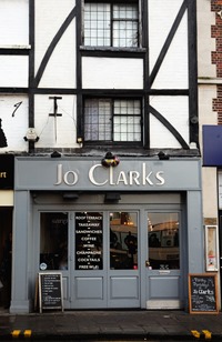
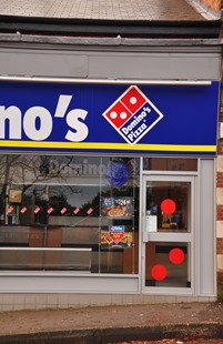
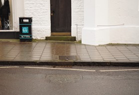
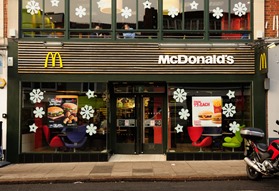
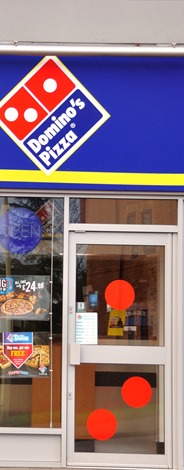
After visiting several locations, experimenting with different views of shop fronts I have come up with four images which I think will provide a reasonable, believable image when edited, cropped and joined up. The most arduous part of this shoot was waiting for parked cars and delivery vans to move and finding suitable locations in the first place. Three of the images are from Guildford High Street and the fourth (Domino’s) is within walking distance of my home in Bordon.
 |  |
 |  |
10/01/2014
1. These are the original crops I made to assemble the image. Having processed them I had to ensure that the scaling was correct. I would like to have included more of the “big brand” shop fronts but using the vertical format I had to crop closely and on the McDonald’s facia, had to move the logo to the left. The centre frontage of Clarks didn’t matter as I was distorting it vertically but I did want to retain the essence of it as a cafe bar. I started off by using this black and white conversion.
 |  |  |
 |
2. This is my first experimental attempt to add the paint to the pavement using Sumo Paint but the “bevel” tool wouldn’t give me a fine enough adjustment and the paint looks more like plastic.

3. I was also unhappy with the monochrome shop front so I used the selection brush in NX2 to selectively remove the colour in streaks. I also made the crop a bit closer.

4. Further experiments with painting in PS Elements using the pencil tool to outline and the fill bucket led to some interesting effects. I also chose to use only the colours from the original image. At this point I made my second attempt at the composite image paying attention to the reflections in the damp paving slabs. At this point I was still unhappy with the Jo Clark’s image.
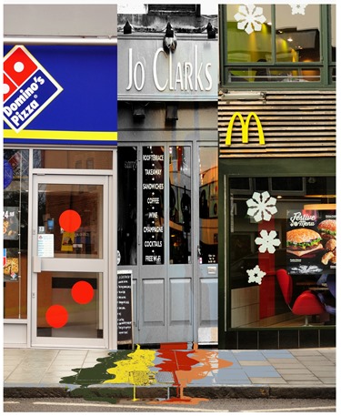
5. My next idea was to use the distort brush to give the image some dynamism. I felt it lacked any interest otherwise. I have tried to retain the sense of the type of business by leaving the window lettering part readable. I also re-thought the McDonalds shop front and decided to re-crop it to exclude the first floor window. I have added the name of the fictional publication and some “dressing to make it look realistic. This is the final image that I will submit to my tutor as a print:
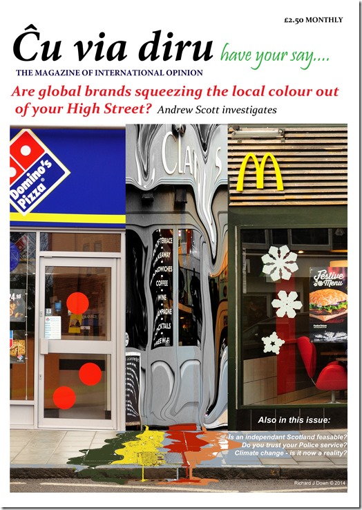
I have produced this image with no thought of deception, rather to use manipulation to construct an image to illustrate a metaphor. I’ve assembled the elements and arranged them in a manner which is obviously the realisation and simplification of an idea, not a physical occurrence.
Reflection on Assignment 4
Demonstration of technical and visual skills: This assignment was challenging in its execution because this is the first really serious attempt I have made at constructing an image of this type. My usual editing software does not have the facility to use layers so I had to learn how to do that. I have shown the image editing skills I learned from this section of the course and have successfully planned and executed this project.
Quality of outcomes: I have used my knowledge and experience to conceive this idea and present it in an original way.
Demonstration of creativity: I think I have been very creative in the way I have used editing software to manipulate this image and interpret this idea.
Context: The proliferation of global brands throughout our environment is something which concerns me especially at the expense of small highly personalised businesses. This image sums up how I feel.
This assignment has been submitted to my tutor as a single print on 13/01/2014.
Subscribe to:
Posts (Atom)